From Population Pyramids to Ternary Plots: Visualizing Data for Demography
At this year’s Population Association of America (PAA) conference, The DHS Program staff (along with co-authors from JSI and Johns Hopkins Center for Communication Programs) presented the first paper in the data visualization session. It was called “Why Demographers Need to be Data Visualization Experts.” It appears we were preaching to the choir. While this was the first year that PAA included data visualization as a topic, the session was attended by almost 200 people, and fellow presenters proved that innovation in data visualization is alive and well.
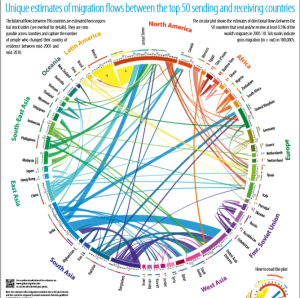
Dr. Nikola Sander, of the Vienna Institute of Demography, cited the Royal Society with the message: “Scientists must learn to communicate with the public, be willing to do so and indeed consider it their duty to do so.” (Royal Society, 1985). She is one of the creators of the Global Migration circular plot visualization that went viral in 2014.
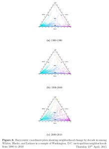
Dr. Michael Bader of American University introduced his visualizations of the distribution of racial diversity in three-dimensional tertiary plots. These 3-D animations allow the viewer to see the distribution of White, Black, Latino, and Asian neighborhoods in different cities. Small multiples (that is, multiple versions of the same graphic showing different pieces of the data) allow for the quick interpretation of change over time (see full paper here).
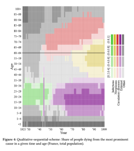
Jonas Schoeley, of the Max Planck Institute for Demographic Research, proposed solutions for presenting composite data on the Lexis surface, including a qualitative sequential color scheme to show the most prominent causes of death over time and by age group in France (see full paper here). This image contains an amazing amount of data, but fascinating data stories quickly emerge, such as the spike in 1944 of “external” deaths. This, of course, was D-Day.
Still, it remains that many academic journals, institutions, and data collection projects do not prioritize data visualization, communication, and dissemination, as part of their standard process. Why should they?
- We are competing with massive amounts of data and information. A good data visualization summarizes the major findings of any scientific study in a concise and compelling way. Assume you have only a few minutes of your audience’s attention.
- A good data visualization is shareable and accessible to a large range of audiences. Visualizations are shareable if they summarize a compelling data story and are beautiful to look at.
- If the researcher or technical expert is not involved in the data visualization process, the accuracy and integrity of the data story may be threatened. Learning the basic principles of data visualization allows the demographer to interact with a larger team, including communication professionals, graphic designers, and programmers.
Ultimately, we are looking for our work to have impact. And measures of impact are quickly changing. We need to think outside the box of submitting papers to academic journals, but expand our toolkit to include user-friendly summaries of findings, interactive web tools, and social media. Data visualization is one of the most efficient ways to tell a complex and compelling data story. As Dr. Nikola Sander summarized, data visualization is not a luxury. It is a requirement.
For more resources on data visualization in global health and demography, visit datavizhub.co. Details on the PAA session and links to abstracts and papers are available here.


Dear all,
could you please send to me the published subject.
many thanx in advanced,
Maisoon Madi,