

How Many Demographers Does It Take to Make a Great Visualization?
How much time do you budget to create a data visualization? The best visualizations, though they appear to be simple and clear, are often the result of dozens of attempts.
Demographers spend countless hours crunching data and preparing journal submissions, but not all take full advantage of data visualization, either in their exploratory analysis, or in communication of their findings. Last month, data visualization enthusiasts met at the Population Reference Bureau for a hands-on workshop as part of the Population Association of America (PAA) Conference. The 4 hour interactive workshop featured presentations from DC-based data viz expert Jon Schwabish, Dr. Tim Riffe, demographer at the Max Planck Institute for Demographic Research (MPIDR), Jonas Schoeley (MPIDR), and Dr. Audrey Dorelien of the Minnesota Population Center. While each presenter had a unique focus, a common theme was clear: your first draft visualization should never be your final visualization. This lesson was put into practice as participants shared works-in-progress, received constructive feedback, and prepared “makeovers”.
Clara Burgert and I have been working on a visualization project for over a year. The original was published last summer but we’ve been reworking it for a journal submission. Our colleagues at the data viz workshop provided constructive feedback, and we have made yet another round of changes. Some of the many stages of our chart “makeover” are presented below.
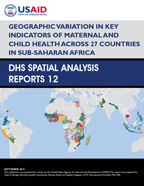
Clara’s recently published analysis looks at 27 countries and 6 child health indicators. The goals of our visualization were to compare countries across these 6 indicators and to illustrate the inequity within countries, by highlighting the worst and best performing sub-national regions. While some countries have a very high measles vaccination prevalence, such as Tanzania, there are regions in Tanzania that are performing very poorly. Meanwhile, other countries have moderately good vaccination rates with very little variation among regions (like Rwanda). Our first real attempt at a publishable graphic looked like this:
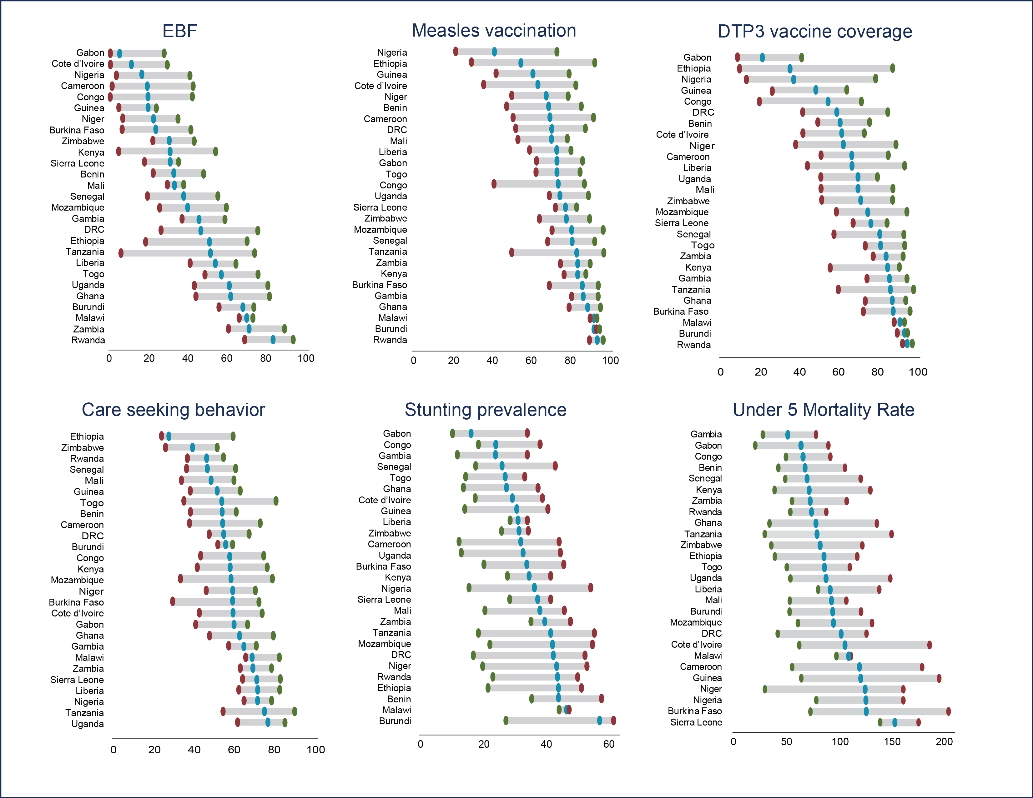
One of the challenges with this first graphic was that it didn’t use color very well. Clara needed to use color to distinguish between the 6 indicators in other places in the report, so we wanted to integrate that color scheme here for consistency. Simultaneously we realized that we could also simplify our use of color in this first draft: while we had originally plotted the red circle as the lowest region, the reader doesn’t need that color to know that that plot is the lowest- it’s obvious based on the axis and the left-to-right understanding of a numerical timeline. So we tried this:

This color scheme worked better to unify the other graphics in the report, and we were feeling pretty good about it. But we still had a few concerns and questions:
- Was it okay to have the axis for the stunting indicator and under-five mortality the same size as the others even though they aren’t at the same scale?
- Was it okay that we were sorting lowest to highest, instead of ordering countries in a consistent way?
- How should we handle ordering of the data when for 4 of our indicators, a high data value is “good”, like vaccination coverage, while for 2 of our indicators, a high data value is bad, like mortality?
- Were there any formatting tweaks we could make to improve readability?
It was this version that was shared at the PAA data visualization workshop. Through the feedback of experts and colleagues, we made some final decisions:
- Change the axis of the stunting indicator to go to 100% so that it is consistent with the other percentages in the graphic. Some suggested that we move stunting and under-five mortality to a separate page to visually remind readers that the interpretation of these indicators is different (i.e., high values are bad). Ultimately, we decided that the layout of the 6 indicators was better for us in terms of publication, but agree that this is a trade-off and may confuse some less technical audiences.
- We decided to keep our sorting from low to high, as the main audience for this paper is looking at general trends, not for data for a specific country. However, reports by The DHS Program often have many audiences, and with that in mind, we created an additional graphic (not shown) that summarizes each of the indicators by country so that a stakeholder in Ghana can see his or her relevant data in one view, without searching for Ghana in each of the above graphics.
- Jon Schwabish had some quick and practical suggestions for making this graphic easier to read. His critique that it felt “heavy” resonated with us as the creators. He suggested thinning out the lines and substituting the big “X” marking the national average with a smaller circle.
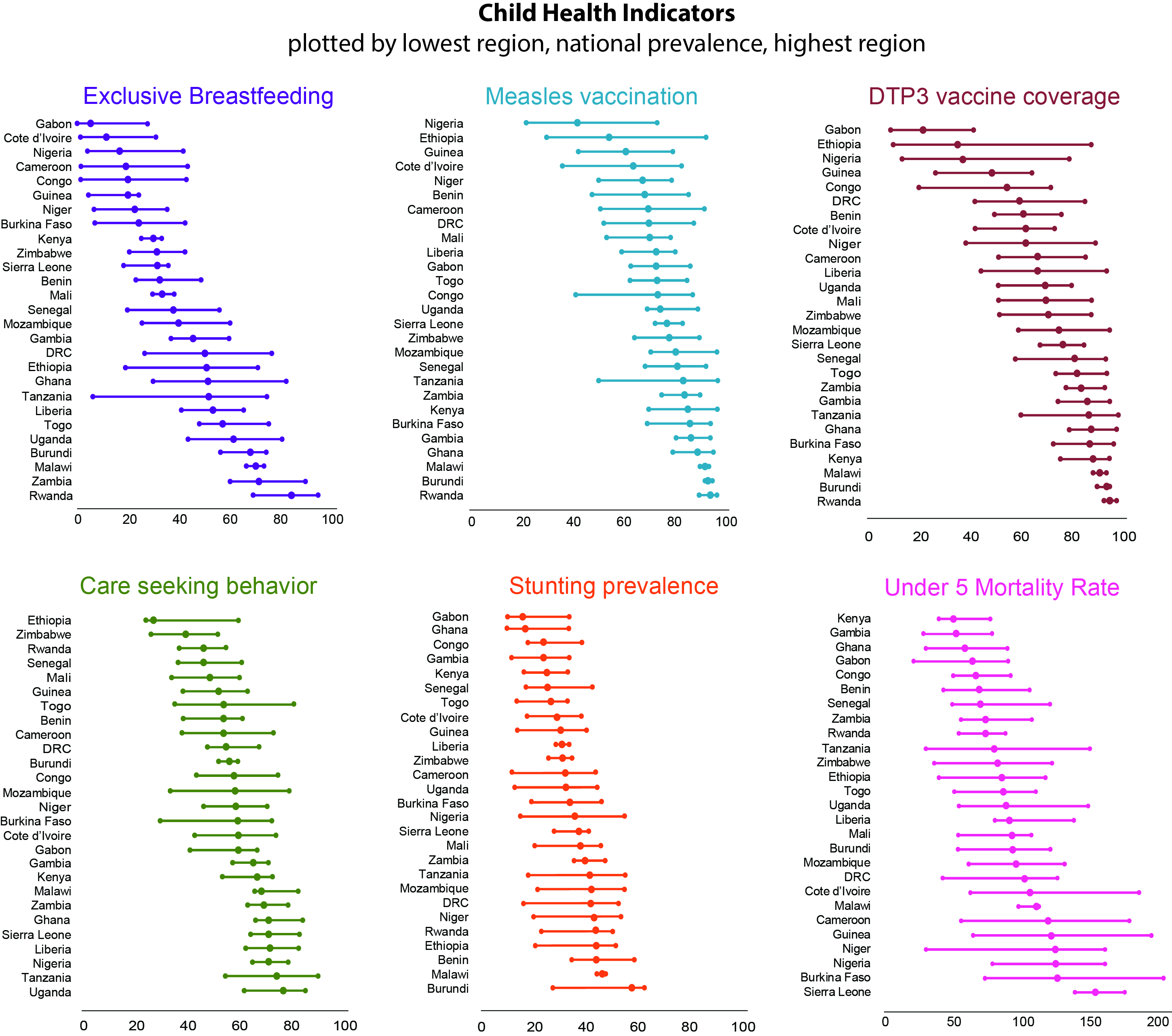
There is a science to data visualization, but there is also a lot of subjectivity. Many solutions can be found only through trial and error. Often it takes time, several new sets of eyes, and dozens of drafts to settle on the best possible visualization for your data. While this is a big investment, there is growing evidence that it’s worth it. We are competing for just 1 or 2 minutes of our audience’s attention in a world filled with data and information. We hope to create a few visualizations that are worth stopping to explore.