

WFS@50 Data Visualization Showcase
2022 marks the 50th anniversary of the World Fertility Survey (WFS). The World Fertility Survey program was established in 1972 with funding from USAID and the United Nations Population Fund. The Demographic and Health Surveys (DHS) Program was created in 1984 as a follow-on project to the WFS. To date, more than 400 surveys have been conducted in over 90 countries as part of The DHS Program.
To celebrate 50 years of data that improves lives, The DHS Program is accepting submissions of data visualizations created using WFS or DHS Program data from data users worldwide through the end of the year. Click through these visualizations to learn about the WFS@50 Data Visualization Showcase.
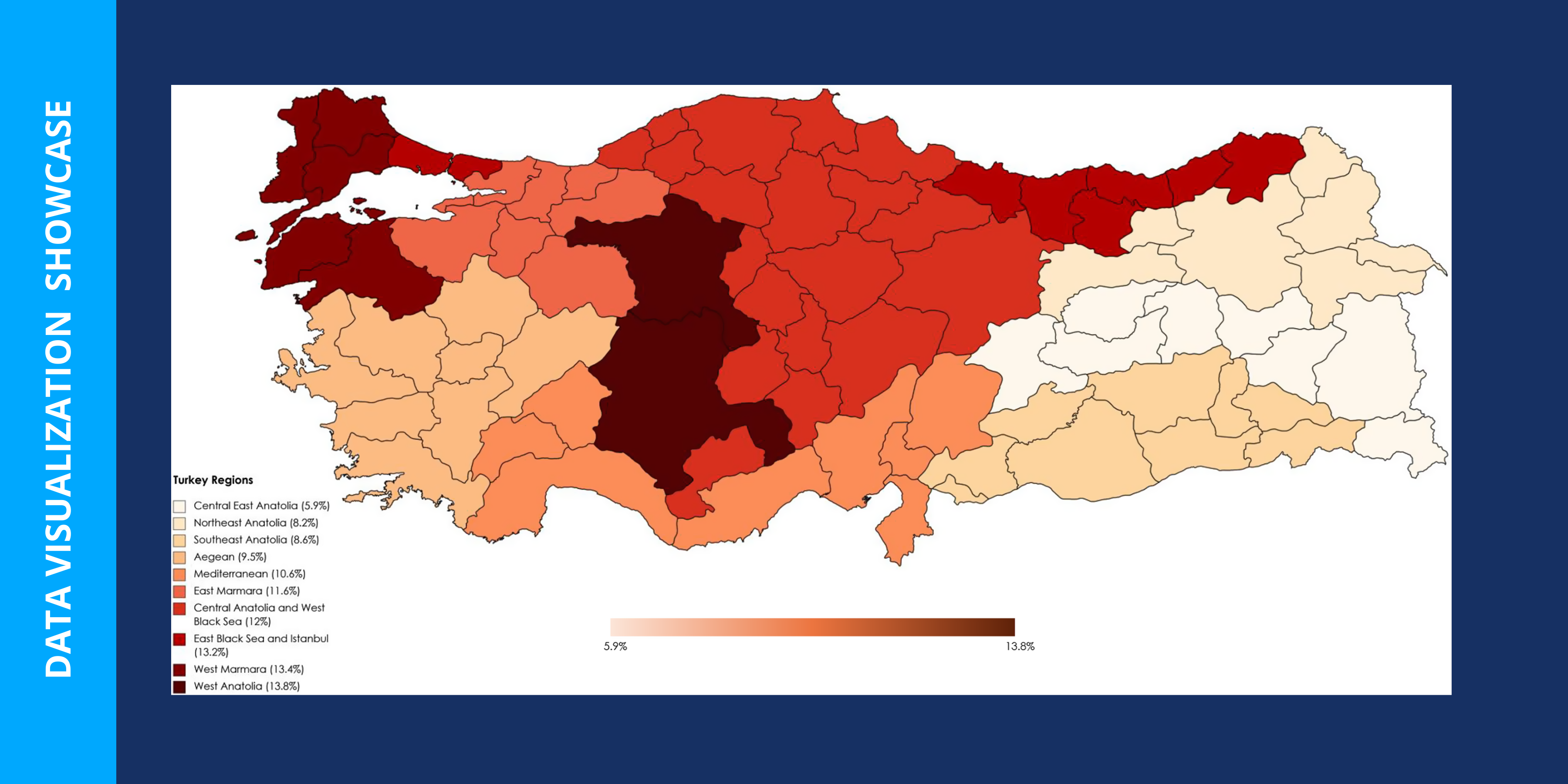
Maps are a great way to visualize data to compare indicators across subnational regions.
“It was aimed to show the prevalence of overweight/obesity in preschool children between regions in Turkey. The difference in prevalence between regions was underlined.” Åžeyma Karaketir, Research Assistant, Turkey
Chad, Côte d’Ivoire, Senegal, Nigeria, and Niger
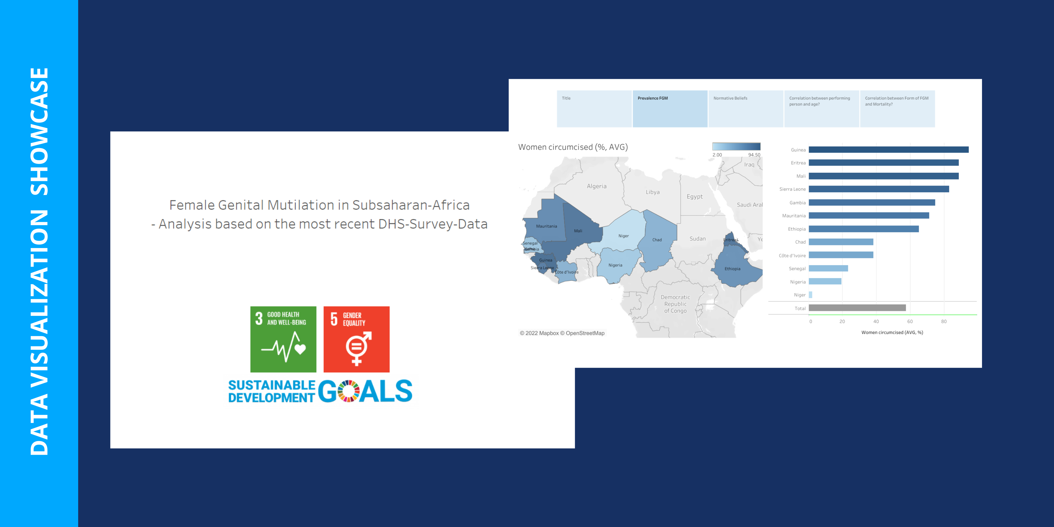
DHS Program data are standardized and available for over 90 countries, allowing users to compare indicators across countries.
“My visualization shows the prevalence of FGC (female genital cutting) in sub-Saharan Africa and the underlying normative beliefs. Further, it is intended to stimulate reflection and to give information on whether there is a correlation between the person performing FGC and age at circumcision as well as between form of FGC and mortality.” Eleana Dongas, Research Associate, Germany
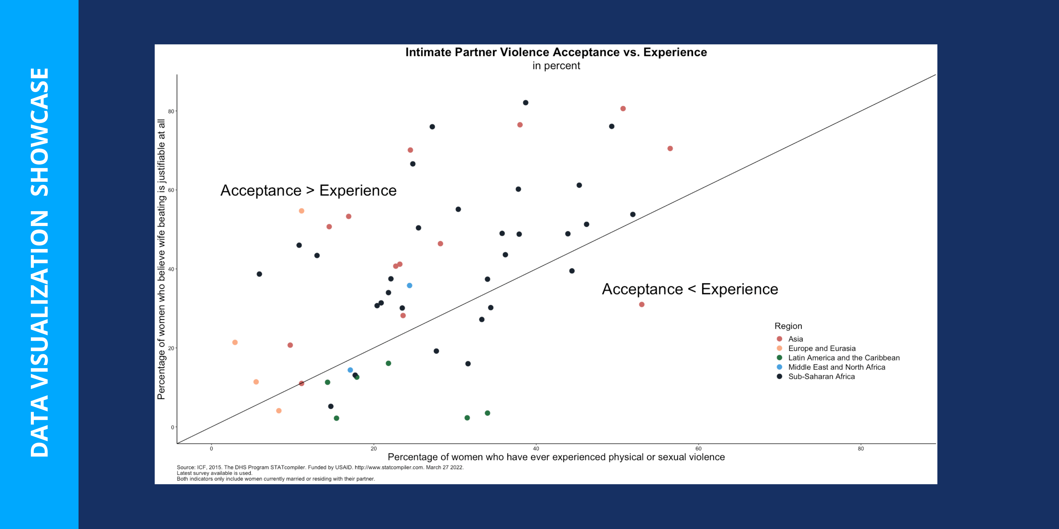
Data visualizations can be used to explore relationships between multiple indicators.
“I use data from DHS surveys from across the globe. I consider two indicators: 1) Physical or sexual violence committed by husband/partner 2) Wife beating justified for at least one specific reason [Women]. I only include in my analysis women that are currently married or living together with their spouse.
“There’s often a gap between women’s experience of intimate partner violence (IPV) and their belief that it is justified. In some regions, such as Latin America and the Caribbean, women are more likely to believe IPV is unacceptable but are more likely to experience it themselves. On the other hand, in much of Sub-Saharan Africa, women are more likely to believe that IPV is justifiable but less likely to report that they have experienced physical or sexual violence themselves.” Hanna Sheldon, United States
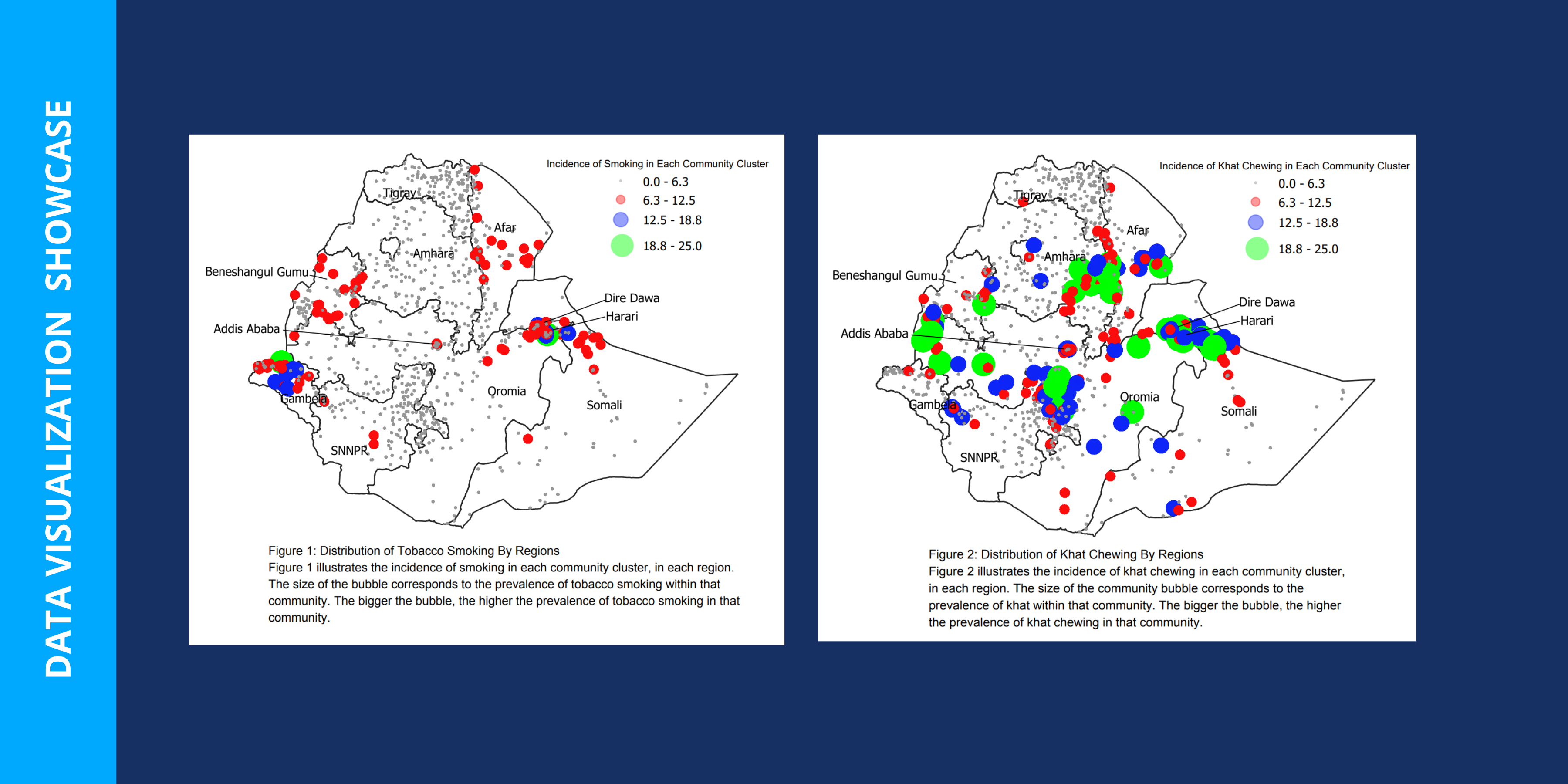
Did you know that DHS surveys collect geographic information? Researchers can link DHS data and geographic data to improve analysis and planning. Read more about The DHS Program’s geographic work.
“Using the Ethiopian GPS and DHS datasets, we mapped the distribution of tobacco smoking and khat chewing prevalence across regions in Ethiopia. Each bubble on the map represents the incidence of smoking/khat chewing for a community cluster in each region. The size of the community bubble corresponds to the prevalence of tobacco smoking/khat chewing within that community. Our work is published in the journal BMC Public Health.” Harminder Guliani, Canada
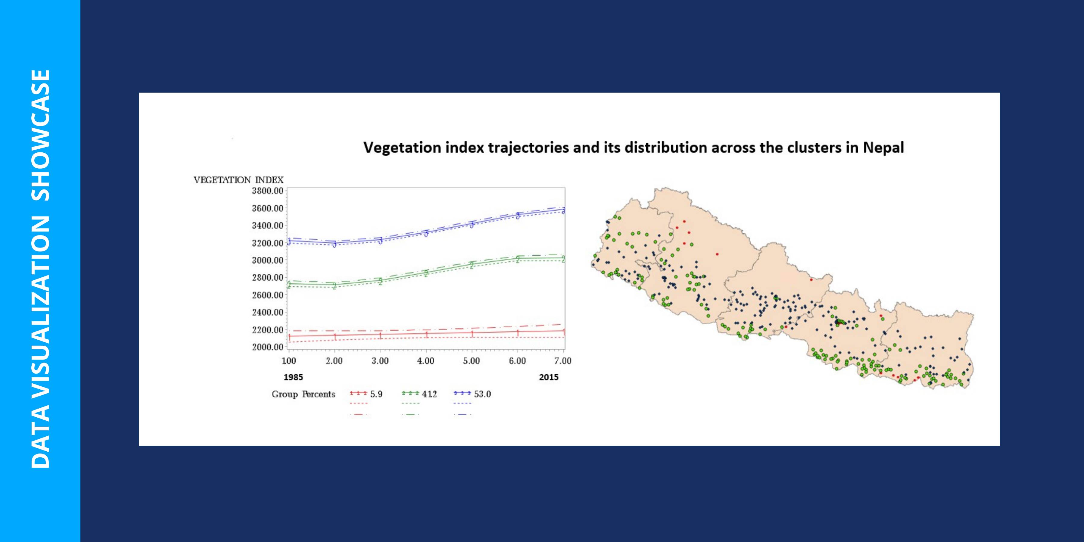
“The graph was plotted using the latent class growth modeling with the objective of classifying clusters (n=383) based on their vegetation index trajectory over the period of 1985 to 2015. Red lines (6% of clusters) showed no change in the vegetation index in the last 30 years. Blue lines (53% of clusters) show higher levels of vegetation index and green lines (41% of clusters) represent intermediate levels of vegetation index. The spatial map on the right shows the distribution of these clusters across Nepal.” Ishor Sharman, Epidemiology student, Canada
Mozambique, Cameroon, Ethiopia, Senegal, Uganda, and Rwanda
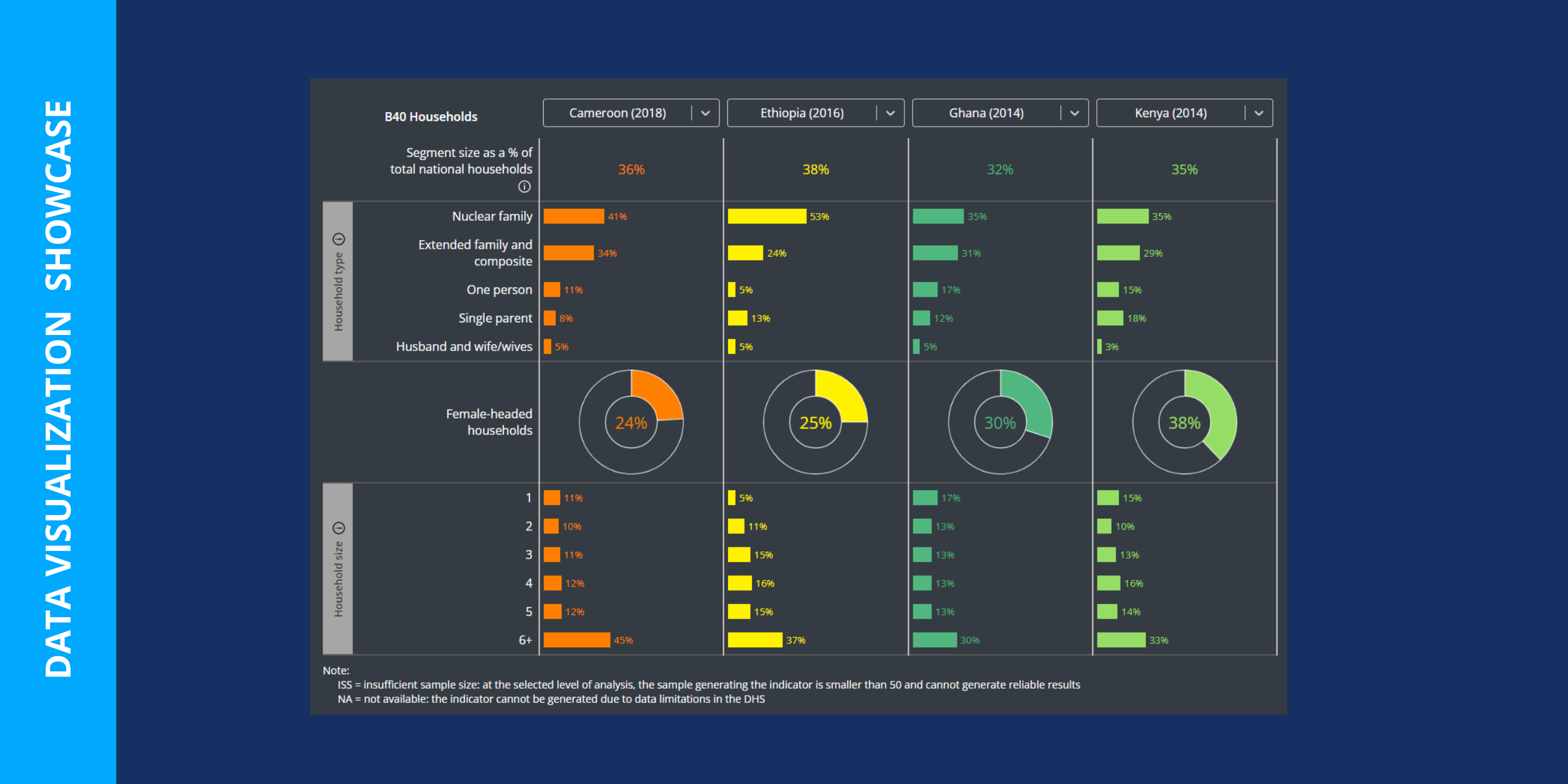
“The Centre for Affordable Housing Finance in Africa (CAHF) B40 dashboard displays household, housing, and individual characteristics for 10 African countries. This gives investors and other stakeholders in the affordable housing development sphere the necessary information to inform product designs that will best suit the needs of the targeted population.” James Scott, Research Analyst, South Africa
Visualizing DHS Program data can help program managers make evidence-based decisions.
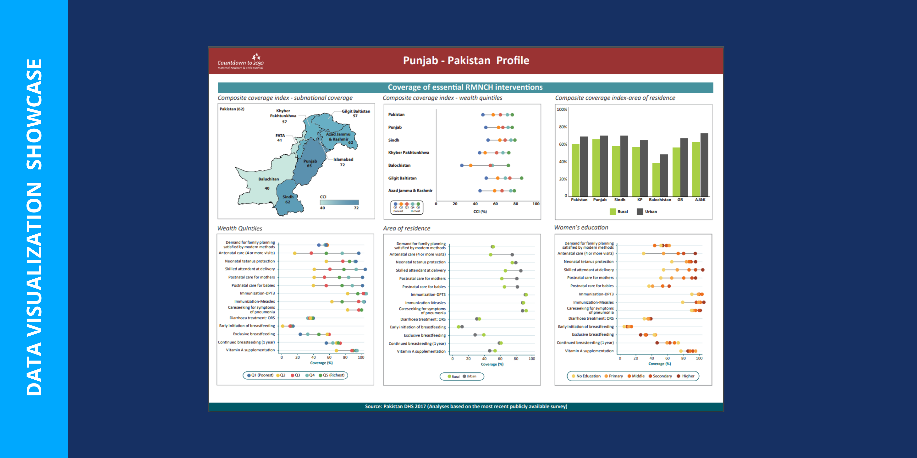
“Socioeconomic inequalities in coverage of reproductive, maternity, neonatal, and child health interventions, putting a focus on equity and reaching the most underserved in Punjab.” Maida Umar, Statistician, Pakistan
Maida Umar was previously featured in our #50Years50DataUsers campaign.
Are you inspired by these visualizations? Submit your data visualization using WFS or DHS data and you may be featured in the WFS@50 Data Visualization Showcase!